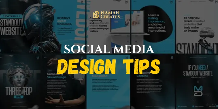
Introduction
In today’s era where everything is digital, the role of social media design has become very important. Every brand wants its content to appear unique and impactful to users, so that they stop while scrolling and engage. But making your brand standout amidst so many posts and ads on social media gets a bit challenging. In this blog, I will give you 5 important tips that will make your social media posts eye-catching, consistent, and platform-specific. Along with this, I will also share a real-world case study that will tell how an Indian brand achieved amazing results with its social media design strategy. If you want to take your brand’s digital presence to the next level, then these tips will be perfect for you. Let’s get started!
Keep Your Branding Consistent in Social Media Design
Every brand has its own unique identity & it is very important to clearly reflect that identity in social media design. When each of your posts feels the same, your audience start recognizes you.
How to maintain consistency?
- Use a defined brand palette (fixed colors & fonts).
- Ensure correct placement of logos.
- Design templates in Canva or Figma so that you can reuse them.
- Pay attention to each platform’s size & layout guides.
Real-World Example:
Social media posts of “Starbucks” are visually aligned across every platform with the same green color tone, simple photography, clean typography. Even their seasonal content doesn’t mismatch the brand.
Prioritize Visual Hierarchy in Your Social Media Design
Social media is a visual battlefield. Thousands of posts are competing every second scroll. So if you want to stand out, the first element of your post should grab the most attention. So that your post becomes eye-catching and able to grab the attention of users.
Elements of Visual Hierarchy:
- Bold Headlines for primary message
- Secondary text in smaller, lighter fonts
- Use color contrast to highlight CTA
- Keep whitespace to avoid clutter
Real-World Example:
Fitness brand “Cure.Fit” uses strong typography in its social media design. CTA buttons like “Join Now” or “Book Free Trial” are visually dominant and it helps to Increased conversion rate from Instagram ads by 20%.
Design for the Platform in Your Social Media Strategy
Every platform has its own design behavior. Like square and vertical formats are popular on Instagram, whereas a professional look suits more on LinkedIn. Bold text and dynamic visuals are more prevalent in Reels.
Platform-wise Design Tips:
- Instagram: Carousel format + storytelling layouts
- Facebook: Large visuals with community-centric appeal
- Twitter: Clear infographics + short visual quotes
- LinkedIn: Clean, formal, informative layout
Pinterest: Tall vertical images with guides & tutorials
Real-World Example:
Zomato’s Instagram design strategy is extremely platform-centric. Witty text on bold red backgrounds, meme-style visuals—everything is tailored for a young audience. This visual tone makes them relatable.
Use Motion & Interactive Elements in Social Media Design
Now the impact of Static design is decreasing day by day. Motion Graphics, Gif & some interactive elements like polls, carousels and Siwipe are getting more engagement. So that we have to focus on these elements In our social media designs for increase engagement.
Benefits of Motion Elements:
- User spent more time on the post
- Animation draws eye movement
- The narrative of the brand is explained in stories or reels.
- Interactive content like polls = higher engagement
Pro Tip:
Canva, Adobe Express & Lottie Files offer drag-n-drop tools to add motion in your design without heavy software.
Real-World Example:
Nykaa used Instagram Reels and animated stories in its “Lipstick Day Campaign”. & Because of it Nykaa get Over 1.5 million views and 40% spike in direct website visits through stories alone!
Keep Accessibility and Readability at the Core of Your Social Media Design
Accessibility and readability should be the core of any social media design. Content should be easily understandable and readable for every user, including visually impaired users. The use of high contrast colors, readable fonts, and proper spacing ensures that text is clearly visible on every screen. Alt text comes with the meaning of images which explain people about the image. If your design only works for sighted users, you are losing the impact of your message. Inclusive design not only expands your reach, but also reflects responsibility and empathy.
Accessibility Tips:
- Check the contrast ratio (dark text on light background & vice versa)
- Font size should be at least 16pt
- Don’t forget to write alt text
- Avoid overly script fonts for body text.
Real-World Example:
The World Health Organization (WHO) maintains visual clarity in every post. High contrast, large readable fonts are a standard part of every post. This keeps them globally accessible.
Case Study: How Amul Uses Social Media Design to Stay Relevant
Brand: Amul India
Strategy: Amul’s topical design strategy is to post a witty creative post on trending news, IPL match or political moment. These posts come in a consistent visual format same cartoon style, same logo placement, and minimal yet powerful messaging.
Impact:
- Amul’s organic reach is highest across Indian brands
- Brand recall is unmatched due to its social media design
- They never use paid ads, yet every post becomes viral
Design Learnings from Amul:
- Topical Design = Relevance
- Consistency = Recognition
- Humor + Visual Format = Shareability
Q&A
Q1: What is the role of typography in social media design?
A: Typography conveys tone, hierarchy, and brand identity. Strong, readable fonts catch attention quickly and communicate the message clearly.
Q2: Should I hire a designer or use Canva for social media design?
A: Canva is best for beginners and small businesses. But if you want highly tailored designs for campaigns or rebranding, hiring a designer is a wise choice.
Q3: How many design formats should I prepare per post?
A: Ideally 3-4: Square (Instagram), Vertical (Stories/Reels), Landscape (LinkedIn/Twitter), and Animated GIF/Reel (optional for engagement).
Q4: How important is color psychology in social media design?
A: Extremely important. Colors evoke emotions. For example, red shows urgency, blue shows trust, yellow shows energy. Your brand colors must align with your message.
Q5: Can templates hurt my social media branding?
A: Only if they’re overused without customization. Use templates as a base, but always tweak them to match your brand’s style.
Conclusion
The goal of social media design is not just to look good, but to be strategic and effective. Your visuals create your brand’s first impression. Consistency, clarity, platform-optimized content, and motion elements together define your brand voice.
Today’s digital audience doesn’t just want to watch, they want to interact, share, and connect. If you apply these “Tips for Effective Social Media Design,” your posts will be worthy of being scrolled down. Remember design is not decoration, it’s communication!