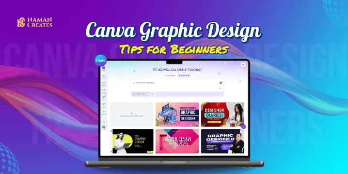
Introduction
Canva graphic design tips are a perfect starting point for beginners if you want to create stunning visuals without any professional designing knowledge. Canva is a drag-and-drop tool that gives you templates, fonts, icons, and elements that turn your creative ideas into reality. In this blog, you will find practical tips that will make your designs simple, clear, and eye-catching.
Canva Graphic Design Tips for Beginners
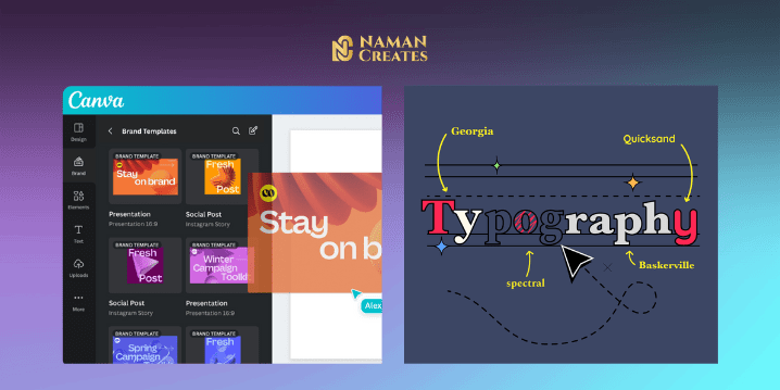
Tip 1: Start Your Designing with Pre-Designed Templates
If you are a beginner, then the best way is to start with pre – designed templates. It helps you to save your time. You just have to choose a template and add your text, colors, and images and you don’t have to think about layout or design rules.
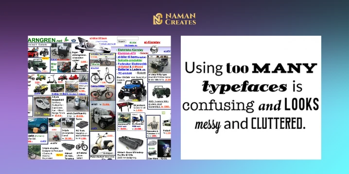
Tip 2: Use Simple and Effective Typography
Typography is an important part of design. When you are designing a creative, use simple, readable fonts. Canva will provide you many font combinations that professional designers use. While designing a creative you should not use more then two or three fonts and the fonts you choose for your design should match the tone of your message.
Tip 3: Maximize Canva’s Design Elements
Canva has collection of icons, photos, illustrations, and stickers. As You are a beginner, you should be careful when using these elements so that they don’t clutter the design, use every element thoughtfully so that it helps you to make design more impactful.
Advanced Canva Features for Beginners
How to Use Grids lines for Structured Designs
Grids are a very important feature of Canva that helps beginners to create organized and well-aligned designs. For enable Grid lines in Canva follow these simple steps: go to the “Elements” tab and search for “Grids”. You can then choose the suitable grid for your design and fit photos or text into those grids.
Adding Animations for Eye-Catching Graphics
The animations feature of Canva can give life to your designs. In the Canva Pro version, you can animate text, images, and entire pages. Simple transitions like fade-in, bounce, and slide-up can make your design engaging. By using these animations, you can make your design that standout on social media platforms.
Canva Design Tips for Social Media
Instagram Tips: Designing Engaging Posts and Stories
Instagram is a platform where you can Showcase your Creativity and Skills. You can Create Instagram post & Storied by Using Canva’s Pre- Designed Templates. These Templates has Already sized Properly according to Instagram format so when you posting the content which is in proper size, it looks more impactful & eye-catchy.
While designing a post you should select a high-contrast visuals that grab attention Immediately. Always use minimum text & fonts. If you are Designing a product or service Based creative, highlight the call-to-action (CTA) Button, so that it can grab Attention. You can also use Canva’s images and icons that can help you to make your design more creative without clutter.
Facebook Tips: Designing Effective Banners and Posts
Canva is a simple and Esay tool to creating engaging designs for Facebook also. You can create Facebook-specific creatives with the perfect size and layout by using Canva.
While designing a post for Facebook you should select a high-contrast visuals that grab attention Immediately. Always use minimum text & fonts. If you are Promoting a product or service, you should highlight the price or offer so that it can grab Attention. You can also use Canva’s images and icons that can help you to make your design more creative without clutter.
Common Mistakes that every Beginner Should Avoid
Overcrowding Your Designs with Too Many Elements
The basic rule of designing is “Less is More”. Most of the Beginners thinks that as much as content they add in the design, it looks better but the result is opposite of what they think. The design becomes messy, text, photos, icons, stickers everything they stuffed in a single creative and this step distracts the user’s attention and the main purpose of the creative is not solved.
Solution:
You Should always use only necessary elements in the design. Keep a clean & Simple Design by using Canva’s alignment tools and spacing features so that every element has breathing space and the creative can grab the attention.
Using Too Many Fonts and Colors
Most of the Beginners use too many fonts and colors to make their design look tempting but because of it creative looks unprofessional.
Solution:
You should always Use 2 or maximum 3 fonts in a design — one for heading and one for body text. Keep the color palette simple, preferably use brand colors. You can use pre-made color palettes in Canva for better color combinations.
Ignoring Alignment and Spacing
Most of the Beginners often ignore alignment and spacing and it makes the design messy and uneven. Some elements are aligned Left, some aligned center, and images and icons are here and there. This distracts the viewer’s focus and the design doesn’t look professional.
Solution:
You can use “Position” and “Guides” tools in Canva to properly align the elements. Equal spacing and balance makes the design look visually appealing. Give each element breathing space so that the content is clearly visible.
Not Considering Mobile View
In today’s time most of the people view the content on mobiles but Beginners makes the design layout they only think about Desktop View & that’s why when user view the content some elements are cut or some are not appears properly in mobile view.
Solution:
You Should check mobile Preview While Design a Creative. Fonts should be Readable on mobile also, each elements should appear properly. You should always test your design on different screen sizes before publishing.

Skipping Brand Consistency
If the style, font, and color of every post is different, then the audience will get confused. Most of Beginners often do this mistake They try something new in every design and because of it, Branding becomes weak.
Solution:
You Should Always use brand colors, fonts, and logo in every Creative. You can use Canva’s Brand Kit feature for maintain the same theme in every design. This makes your content recognizable and builds trust in audience.
Conclusion
By following these Canva graphic design tips you can change your basic designs into a professional and branded look. Whether you are creating an Instagram post or Facebook banners if you use pre – designed templates, balance typography and colors, and pay attention to alignment, you can create impactful visuals. With little practice on Canva you can take your designing skills to the next level without any costly software.