Introduction
This blog of Font Pairing Secrets is for beginners who wants the perfect balance in designing whether you are a graphic designer, a freelancer, or building your personal brand. Fonts combinations don’t just display text, they determine the mood, message, and personality of your design. In this blog, we will cover everything from the psychology of font pairing to branding, portfolio, accessibility, and future font trends of 2025 with excellent practical examples and tools. So, let’s begin with a visual journey where the role of every font combination matters.
The Psychology Behind Font Pairing in Visual Design
How Font Pairing Affects Perception, Trust, and Emotion
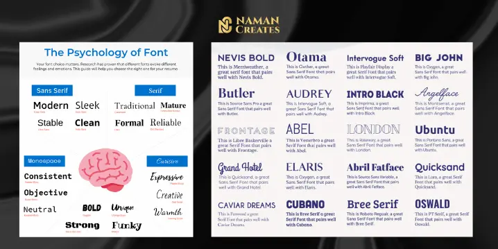
Font Pairing is not just a design element; Fonts are the most important part of the Design that directly impacts human psychology. Fonts plays a big role when we are creating a first impression of a brand or personal portfolio. The perfect font combinations can help clarify that what is the intent of the design. When users see a website or brand, an instant emotional reaction is triggered in their minds and this is largely due to the fonts. Bold fonts show confidence, while script fonts show softness and elegance.
The psychological impact of font Combinations helps you to build trust and authority. If you are designing for a financial or legal brand, then you should use serif fonts because serif Font Combination give traditional & trustworthy feel. On the other side if you are working for a youth-focused brand, then the font combination of funky and modern font can be more engaging.
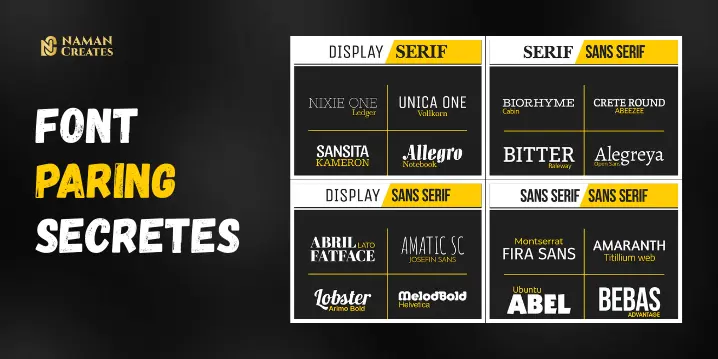
Choosing Font Pairing Based on Audience and Brand
The most important step is to choose the right font Combinations according to your audience and brand. Every brand has a tone, it can be casual, formal or playful. We have to pair the fonts according to that tone so that the font pairing can communicate visually.
If you select the wrong font combinations, it can break the trust & the brand value goes down. For example, using the comic font for convey a serious message. So, according to your audience research, select the best font combinations so that it can match the brand’s voice.
Font Combinations for Personal Branding and Portfolio Design
Defining Your Visual Identity Through Font Combinations
Font pairing is the secret behind a strong personal brand. When someone check your resume, website or portfolio, the first impression is made by your fonts. Your font selection can reflects your professional style.
Font pairing also helps you to differentiate you & your designs among other professionals. A clean sans-serif + serif font combination shows you a balance in between modern and classic fonts. This balance is appealing to recruiters and clients and helps you to get better results.
Keeping Font Combinations Consistent Across Resume, Website & Portfolio
The magic of font pairing only works when you maintain the same font combinations across to every platform. If the font pairings are different on your resume and the website is different, then it can impact on your brand appearance.
The consistency of Fonts makes your design look professional. Tools like Canva provide you templates where you can save your best font combinations and reuse them according to you purpose.
Creating a Scalable Font Pairing System for Clients
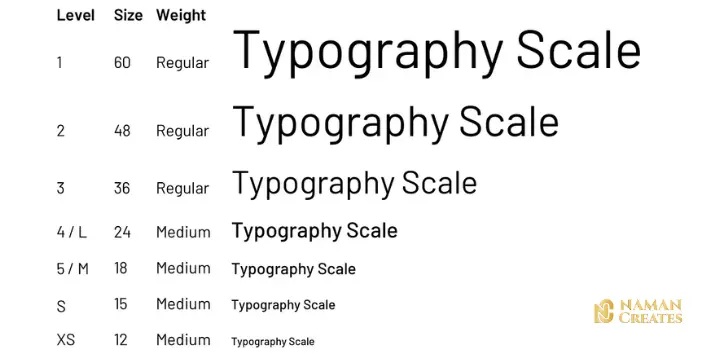
Setting Rules for Font Pairing in Headline, Subhead & Body Text
Font pairing is very effective when there is a solid or impactful typography system behind it. When you are creating a brand or website for a client, you need to define a clear hierarchy for the headline, subhead, and body text.
While creating a font combination system, just make sure that contrast and readability are maintained perfectly. The heading should be bolder & attention grabbing, the subheading and the body text are perfectly readable. The structured font combinations can make the design visually appealing.
Building a Reusable Font Combination Guide for Long-Term Client Use
Creating a perfect Font Pairing guide can be a long-term asset for clients & brands. This font paring guide clearly mentions that which fonts are going to be used for presentations, which fonts for social posts & which fonts for web content.
You can also create Font combination guide in Canva Graphic Design, where you can choose predefined font combinations by setting up a brand kit. When the client works with your team, this font paring guide will help to keep their brand consistency.
Accessibility in Font Combinations: Designing for Every User
Choosing Font Combinations That Ensure Readability and Inclusivity
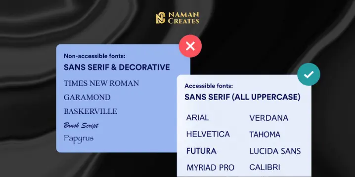
The role of font pairing is not just limited to aesthetics only; font paring is equally important in accessibility also. Every user has an equal right to read content so you should assure that combination of your fonts must be simple, clean & readable for every user.
Font pairing is accessible when there is enough contrast between fonts, and their shape is clear. Decorative or compressed font combinations can create problem on screen for user also these types of font combinations confuse user. So we should always use simple & clean fonts like Open Sans, Inter, or Georgia in your font combinations for maximum readability.
Tools to Test Accessibility and Validate Font Combinations
Using tools to validate font pairing is a smart move. You can check contrast and readability using the WebAIM contrast checker or the Stark plugin of Figma.
Using these tools for font pairing gives you surety that your design is accessible for every user and accessibility is not just ethical, it is google friendly & Accessible font combinations can directly impact SEO.
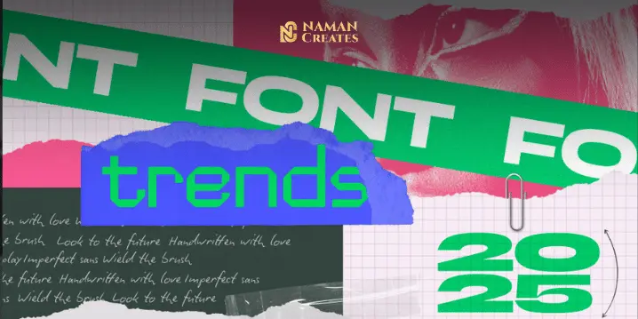
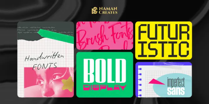
Future of Font Pairing Trends to Watch in 2025
Outdated Font Pairing Techniques Designers Should Avoid
Font pairing also like fashion. Because of overuse some font combinations have looks outdated. Like font combination of “Roboto & Open Sans” this pair of fonts not look fresh in Morden Designs.
Using of similar fonts in font combination can destroy the contrast so you should avoid these types of font combinations. Contrast is an important part in a creative because it creates clarity and focus. For 2025 Designers has already shifted towards variable and responsive font combinations.
Modern Font Pairing and the Rise of Variable Fonts
The future of font pairing is in variable fonts which has multiple weights and styles in a single font file. These font pairing is ideal for responsive designs and also improves performance.
Here are some modern combinations for font pairing that are trending in 2025:
• Inter Variable + EB Garamond
• Space Grotesk + Spectral
• Neue Montreal + GT America
These best font combinations will give you an edge in modern, accessible and responsive design. Especially when you use Graphic Design or web tools.
Conclusion
Font pairing is a creative and strategic process that makes your designs beautiful, impactful and accessible. Whether you are working on personal branding or creating a brand identity for a client, choosing the right font combinations makes your work to standout. Using tools like Canva, you can make your font system even more easy and scalable. Keeping in mind the design trends of 2025, you can make your designs future-ready by using responsive and variable fonts. Just remember every font has a purpose, and when fonts are paired right, it creates visual magic.